Ready for some more Before and After photos?!
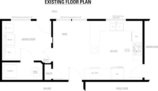
Let's start with the overall floorplan:
The most obvious change in both the floorplan and the photos is the absence of the peninsula. Walking through this kitchen felt a little like walking through a maze. It just wasn't straightforward. First you had to open a swinging door, then step around cabinetry and it just felt like more work than they wanted. We got rid of the peninsula and replaced both swinging doors with pocket doors so there is no protuberances into the room anymore.
The kitchen was very dark as well. It looked out onto the covered porch, so not much light actually got to come in. We fixed this by adding suntubes and moving the laundry room wall. Moving the wall to the other side of the exterior door to the porch made the room a little longer and more open. It also gave another window for light (the window being in the door itself).
Not only does removing the peninsula open up the room, but removing the double ovens has the same effect. We moved the stove from the far end of the kitchen to the wall opposite the sink. It actually took the place of the old refrigerator, and the refrigerator just slid down against the wall. The reason the refrigerator wasn't already butted up against the wall was because that was where the doorway into the kitchen was. We just decided to move the doorway.
Moving the doorway ultimately made us shorten the length of cabinetry of the same wall. It turns out, it didn't really make much difference because of the new counter space we gained by moving the stove.
This whole refrigerator/wall oven side-by-side combination just didn't work. Even though it isn't as thought they are sticking out very far, it still seemed to impede views and made everything seem tighter. This is where the new stove and hood were relocated.
This is a good opportunity to point out the new lighting in the kitchen. See how much brighter it became? We replaced the old incandescent ceiling mount fixture with new energy efficient lighting (and remember, the suntubes!). The sink got a new pendant light and the chandelier above the kitchen table got a much needed update as well.


No comments:
Post a Comment