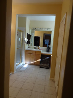
...complete with before and after photos!
This bathroom mostly just needed a good material update, so there wasn't any major overhaul with the floor plan. We only had to change one wall to make the shower bigger. See how the vanity connects to the wall on the left? Well, we wondered "what is behind there? Why can't we extend shower all the way back?" As it turns out, there was nothing stopping us from doing just that! Just look at how much bigger the shower is now.
Before After
The vanity originally dropped down on the right side as a sort of vanity seating area. The client saw no need for this anymore, so we were able to bring the vanity straight across for more counter space. There are actually 2 vanities in this bathroom and they were both redone in the same materials.
Before After After
This is the other vanity that is next to their walk-in closet. They moved the magnifying mirror to this vanity since there was no longer space for it now that the shower eliminated the wall that it was attached to. This is a great shot to point out that there are no exposed outlets. All electrical outlets are located inside the vanity cabinets. This keeps the vanity clear and organized.
Before After s
They decided to keep the jet tub, but it also needed a material update. We extended the back splash from the vanity all the way around the tub enclosure. The tub deck and walls were redone in the same tile as the flooring and shower walls. Not only does it look great, but it ties everything together nicely.
Before After f
One of the reasons for the remodel was the existing plumbing fixtures and bathroom hardware. It was full of gold colored knobs and faucets and they hated it! It not only outdated the space, but it just didn't match with the style and feel they had made for their home. The gold was replaced with this chic looking brushed nickel. It worked out perfectly with the shades of the new tile, granite and mosiac.
This bathroom is just full of little details that tie the whole room together. Here is another example of one. The shower seat is made from some of the leftover vanity counter top granite. The pebble stone shower pan takes colors from the granite marbling as well as some of the tile floor and shower wall tones.
They are very pleased with their new Master Bathroom. In fact, they shared with us that it now has the most used shower in the house! They shared with us that when their children come home, they all want to take advantage of the new comfortable space.
Want to see more? You can see all of the pictures on our website or check them out and let us know what you think on Facebook.


I am blown away by the new bathtub setup. The main tile looks excellent, I just think the sink looks a little bland being just white. Overall looks fantastic.
ReplyDelete-Irwin Zinkin
Shower Doors Nassau County
I decided that having a master bathroom the size of a crackerjack box was worse than having to deal with the stress of a remodel before we move.
ReplyDeletesteam spa steam generator combo