Monday, June 4, 2012

K.B. Kitchen Remodel

Ready for some more Before and After photos?! 
Let's start with the overall floorplan:
The most obvious change in both the floorplan and the photos is the absence of the peninsula.  Walking through this kitchen felt a little like walking through a maze. It just wasn't straightforward.  First you had to open a swinging door, then step around cabinetry and it just felt like more work than they wanted.  We got rid of the peninsula and replaced both swinging doors with pocket doors so there is no protuberances into the room anymore. 

The kitchen was very dark as well.  It looked out onto the covered porch, so not much light actually got to come in.  We fixed this by adding suntubes and moving the laundry room wall.  Moving the wall to the other side of the exterior door to the porch made the room a little longer and more open. It also gave another window for light (the window being in the door itself).


Not only does removing the peninsula open up the room, but removing the double ovens has the same effect.  We moved the stove from the far end of the kitchen to the wall opposite the sink.  It actually took the place of the old refrigerator, and the refrigerator just slid down against the wall. The reason the refrigerator wasn't already butted up against the wall was because that was where the doorway into the kitchen was.  We just decided to move the doorway.  


Moving the doorway ultimately made us shorten the length of cabinetry of the same wall.  It turns out, it didn't really make much difference because of the new counter space we gained by moving the stove.


This whole refrigerator/wall oven side-by-side combination just didn't work. Even though it isn't as thought they are sticking out very far, it still seemed to impede views and made everything seem tighter.  This is where the new stove and hood were relocated.


This is a good opportunity to point out the new lighting in the kitchen. See how much brighter it became?  We replaced the old incandescent ceiling mount fixture with new energy efficient lighting (and remember, the suntubes!).  The sink got a new pendant light and the chandelier above the kitchen table got a much needed update as well.


Want to see more? You can see all of the pictures on our website or check them out and let us know what you think on Facebook.

Wednesday, May 30, 2012

W. Master Bathroom Addition

The W. Master Bathroom addition is ready to view!


This client had us do the full design on their new addition.  This means they got full color renderings and tile options of their project to consider.  These drawings give the best views possible to be able to get a feel of what they could expect.  I must say, they are never too far off. Just take a look for yourself!

Our Renderings:


Real Photos:


This area, where the dressing vanity is now, used to be their old Master Bathroom.  It left a big empty space in the room, so we filled it with a place to get ready.  Can you even imagine how cramped the old bathroom must have been?  
The door next to the vanity is their old closet, but with the new addition they actually gain a whole other (very spacious ) walk-in closet.

The new Dressing Vanity:

The entry to the new walk-in closet:

To save a little money, we re-used their existing jet tub, and made it more beautiful with a new tub-deck.
In this photo you can see there is a door next to the tub. This is the Water Closet.  If you refer to the floor plan above you can see how the Water Closet fits with the rest of the Master Bathroom.


Of course they needed a comfortably large shower enclosure!  We used the same granite on the walls of the shower as is used on the 2 sink vanities and the tub deck which effectively ties the whole room together.


Shower complete with a rainshower head.

To make their expansive Master Bathroom more like their very own spa, we installed a dry sauna. Getting jealous yet?  They shared with us how much they love their new sauna. They use it all the time!


To make this space even MORE comfortable (was that even possible?), they have this towel warmer between the shower and sauna.


In addition to keeping their towels warm, they keep their feet warm too!  This beautiful tile flooring has warmers underneath. The warmers are on a timer, so when they get up in the mornings they never have to hurry across it again.


One last detail are these custom vanities.  The bowl takes golden hues from the countertops and cabinetry making it look like it was even custom colored just for this bathroom!


Want to see more? You can see all of the pictures on our website or check them out and let us know what you think on Facebook.

Tuesday, May 22, 2012

J.H. Master Bathroom Remodel


...complete with before and after photos!

This bathroom mostly just needed a good material update, so there wasn't any major overhaul with the floor plan. We only had to change one wall to make the shower bigger. See how the vanity connects to the wall on the left?  Well, we wondered "what is behind there? Why can't we extend shower all the way back?" As it turns out, there was nothing stopping us from doing just that! Just look at how much bigger the shower is now.

     
                            Before                                                               After

The vanity originally dropped down on the right side as a sort of vanity seating area. The client saw no need for this anymore, so we were able to bring the vanity straight across for more counter space.  There are actually 2 vanities in this bathroom and they were both redone in the same materials.

  
                              Before                                                           After                                             After                                                               

This is the other vanity that is next to their walk-in closet.  They moved the magnifying mirror to this vanity since there was no longer space for it now that the shower eliminated the wall that it was attached to.  This is a great shot to point out that there are no exposed outlets.  All electrical outlets are located inside the vanity cabinets. This keeps the vanity clear and organized.

                            Before                                                               After                                 s

They decided to keep the jet tub, but it also needed a material update. We extended the back splash from the vanity all the way around the tub enclosure. The tub deck and walls were redone in the same tile as the flooring and shower walls.  Not only does it look great, but it ties everything together nicely.

Before                                                                                After                                                                                            
   
One of the reasons for the remodel was the existing plumbing fixtures and bathroom hardware.  It was full of gold colored knobs and faucets and they hated it! It not only outdated the space, but it just didn't match with the style and feel they had made for their home.  The gold was replaced with this chic looking brushed nickel.  It worked out perfectly with the shades of the new tile, granite and mosiac.


This bathroom is just full of little details that tie the whole room together.  Here is another example of one. The shower seat is made from some of the leftover vanity counter top granite. The pebble stone shower pan takes colors from the granite marbling as well as some of the tile floor and shower wall tones.


They are very pleased with their new Master Bathroom. In fact, they shared with us that it now has the most used shower in the house!  They shared with us that when their children come home, they all want to take advantage of the new comfortable space.


Want to see more? You can see all of the pictures on our website or check them out and let us know what you think on Facebook.

Monday, May 14, 2012

L. Kitchen Remodel

The L. Kitchen Remodel was a full design package.  We drew a new floor plan, new cabinetry and chose new materials.  The conceptual drawings we do at the beginning of the project give you a very good idea of what to expect your new space too look and feel like.  They are an excellent start point as far as materials, appliances, plumbing and lighting go as well.


Usually our Before and After pictures line up nicely so that you can see exactly what has been done.  The before and after photos of this project vary so much since we moved a whole wall, that we thought it would be helpful to include a before and after floor plan to compare.


Before

 After

We opened up the wall that separated the Dining room and the Kitchen and tied it together with counter seating.  
This client does a lot of cooking, so it was important to them that they have some counter space.  It was difficult to maneuver the new floor plan around existing storage spaces, but we couldn't be happier with the way it turned out. As you can see, the sink stayed put, the stove moved to another wall and the refrigerator moved to the other end of the kitchen to allow for more work space.

                           
Before                                                                                  After                                                                   


        Before                                                                                  After                                                 s    

                                                
                                   Before                                                                                 After                            


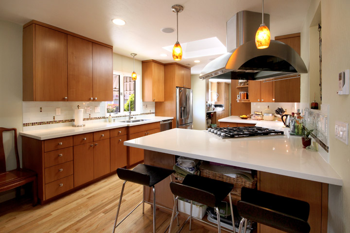
This client was a fan of a more modern look.  They traded raised panel white cabinetry with slab doors on stained alder wood.  When I asked how they were liking the new modern feel they said they loved it.  It is so much less work cleaning than the raised panel doors. With a slab door you can just wipe it down and not worry about the divots. The flooring went from old tiling, to a hardwood floor to match the rest of the house.  The back splash was a very old school square tile so they traded up for a more modern long glass subway brick with accent mosaic.


By choosing a full design package, they got more work and storage space, and a better connectivity from the Dining Room to the Kitchen and some great new updated materials.  They are loving the new kitchen, and we had fun creating it for them.


Want to see more? You can view the whole gallery on our website or check them out and let us know what you think on Facebook.